2019 ~3 months
UX, UI
Photobox is a print giant with millions of users. They tried to redesign the interface a few times, but their loyal user base kept rejecting the new designs. The old version was clunky, but it was familiar to them. As a consultant, I had 3 months to redesign the editor experience for good before the tech was phased out, and set a strong foundation for the in-house team. I did all of the UX and UI design, managing 1 junior designer.

Reducing cognitive load
User research found that customers had a non-linear journey, and felt lost with the number of tools and options available. So I relied heavily on progressive disclosure, like contextual menus that would only appear once a certain element was selected. This would limit the number of options users could see on the screen, but still give them many tools to play with.

I rewrote a lot of the copy and labels to ensure any text used only simple language in full sentences, rather than “computer-speak”, jargon or terms only used on our website. The simpler the language, the easier it is for users to navigate and perform tasks.

Building trust through transparency
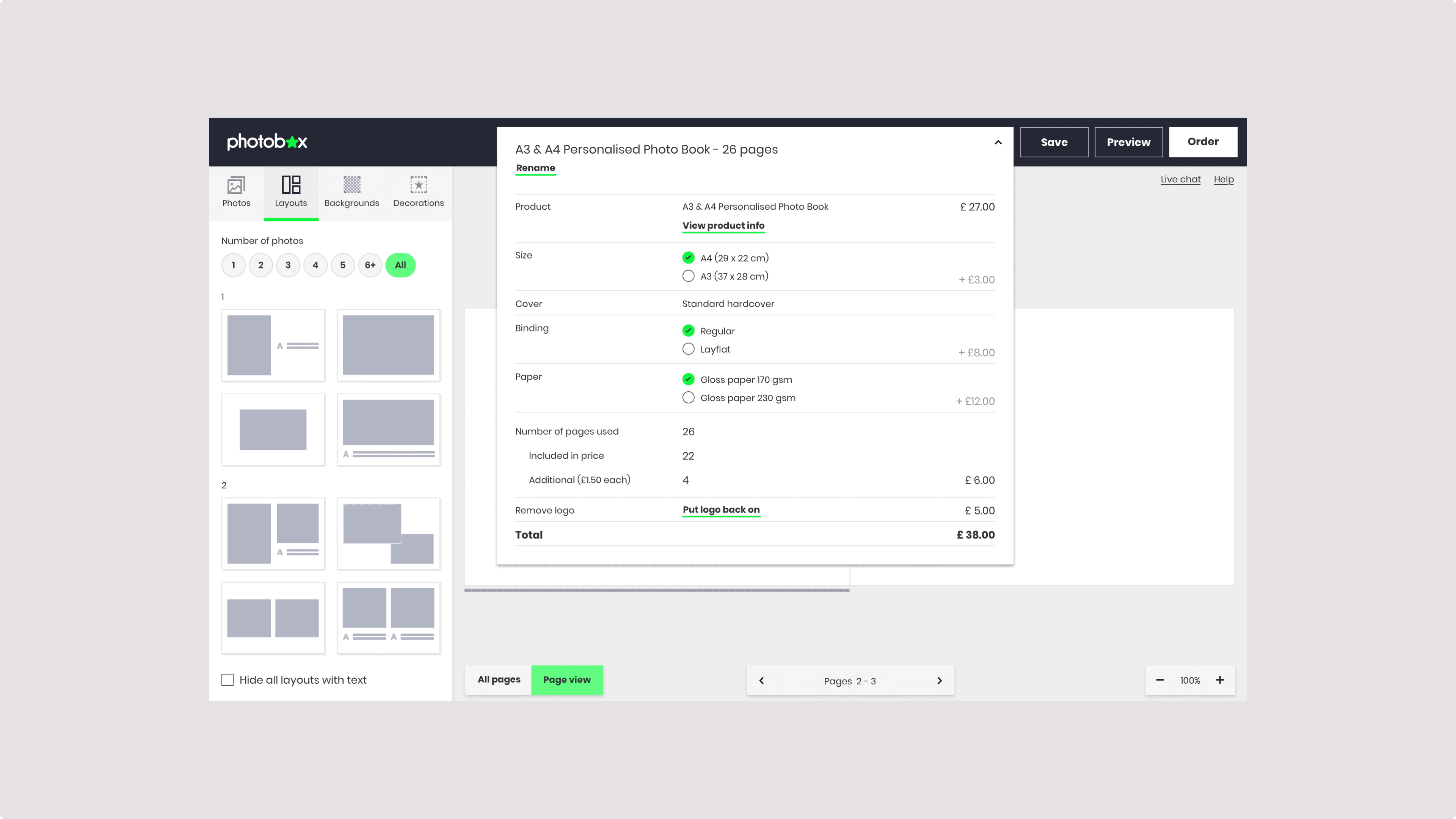
Speaking to customer service reps, I discovered that users were sometimes disappointed to find the album turned out more expensive than they originally thought. The price increased as they added more pages, and this was clear in the e-commerce side, but not inside the editor. To avoid this, I brought the product configuration front-and-center, clearly explaning how much everything cost, and allowing them to change any settings before they checked-out. They were also warned every time they added a new set of pages.

So what happened?
The new version performed very well in usability tests. Long-time users said they preferred the new version and would be happy to change. A/B test confirmed this with data, showing an increase in engagement and sales in comparison to the original. The new version was launched to all users shortly thereafter.
I left behind simple but neat documentation for the future in-house team, with insights on all features, including the ones we didn't get a chance to work on.
They have since updated the brand colours and introduced new features, but the functionality I designed is still mostly still in use today.
"Monique has just wrapped on a 3 month project with us, redesigning our core creations experience, and it goes without saying she will be missed by everyone. Her professionalism and thorough attention to detail, along with her wholistic approach to experience design have made her a truly valuable asset to the team. She is collaborative by nature and never backwards in sharing her thinking and approach in a calm and measured way. I'd recommend anyone to work with her and hope to have her back in with us the first chance we get. Thanks Monique.”